Indivision
Indivision
Indivision is a wide spectrum company that provides any kind of services in the field of printing and production. Their activities include a large number of tasks in production field, namely: the development of ideas, design, literature, editing, adjustment, delivery, packaging, design of POSM, logistics and production in Russia and in China.
Problem: Employees of the company want to have a visual culture of the company. The company needs a visual culture to attract new customers and retain old ones.
Task: To build a design system that will emphasize the company’s services and will be easy to use.
Industry
Production sphere
Client
Indivision
Category
Brand design
Brand identity
Motion design
UI/UX Design
Credits
Motion design: Kirill Troshin
Brand identity: Inna Efimova
Awards
Short list SREDA
Short list ADCR Russia
Indivision is a wide spectrum company that provides any kind of services in the field of printing and production. Their activities include a large number of tasks in production field, namely: the development of ideas, design, literature, editing, adjustment, delivery, packaging, design of POSM, logistics and production in Russia and in China.
Problem: Employees of the company want to have a visual culture of the company. The company needs a visual culture to attract new customers and retain old ones.
Task: To build a design system that will emphasize the company’s services and will be easy to use.
Industry: Production sphere
Client: Indivision
Category:
Brand design
Brand identity
Motion
design
UI/UX Design
Credits:
Motion design: Kirill Troshin
Brand identity: Inna Efimova
Awards: Short list SREDA
Short list ADCR Russia
-
-
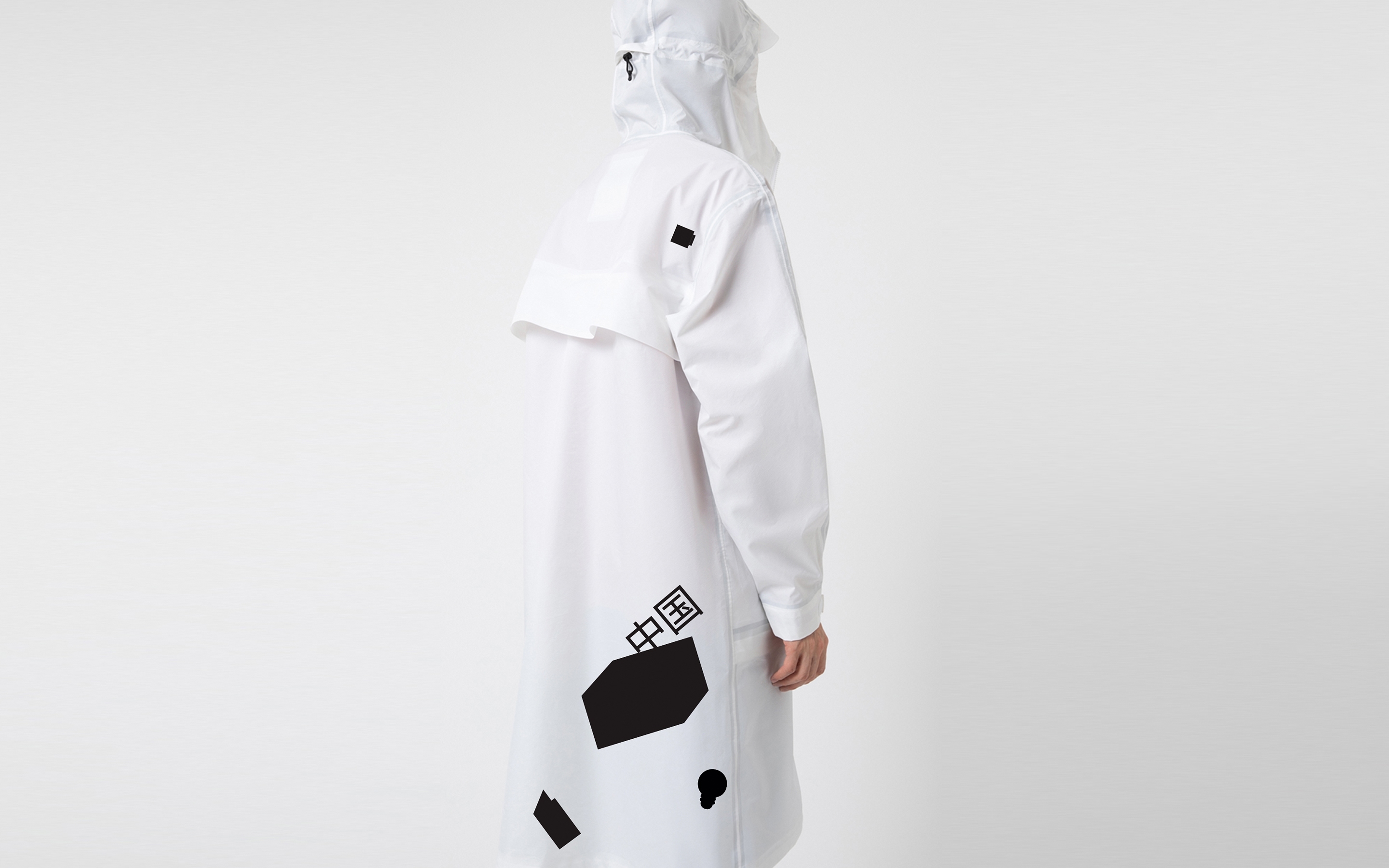
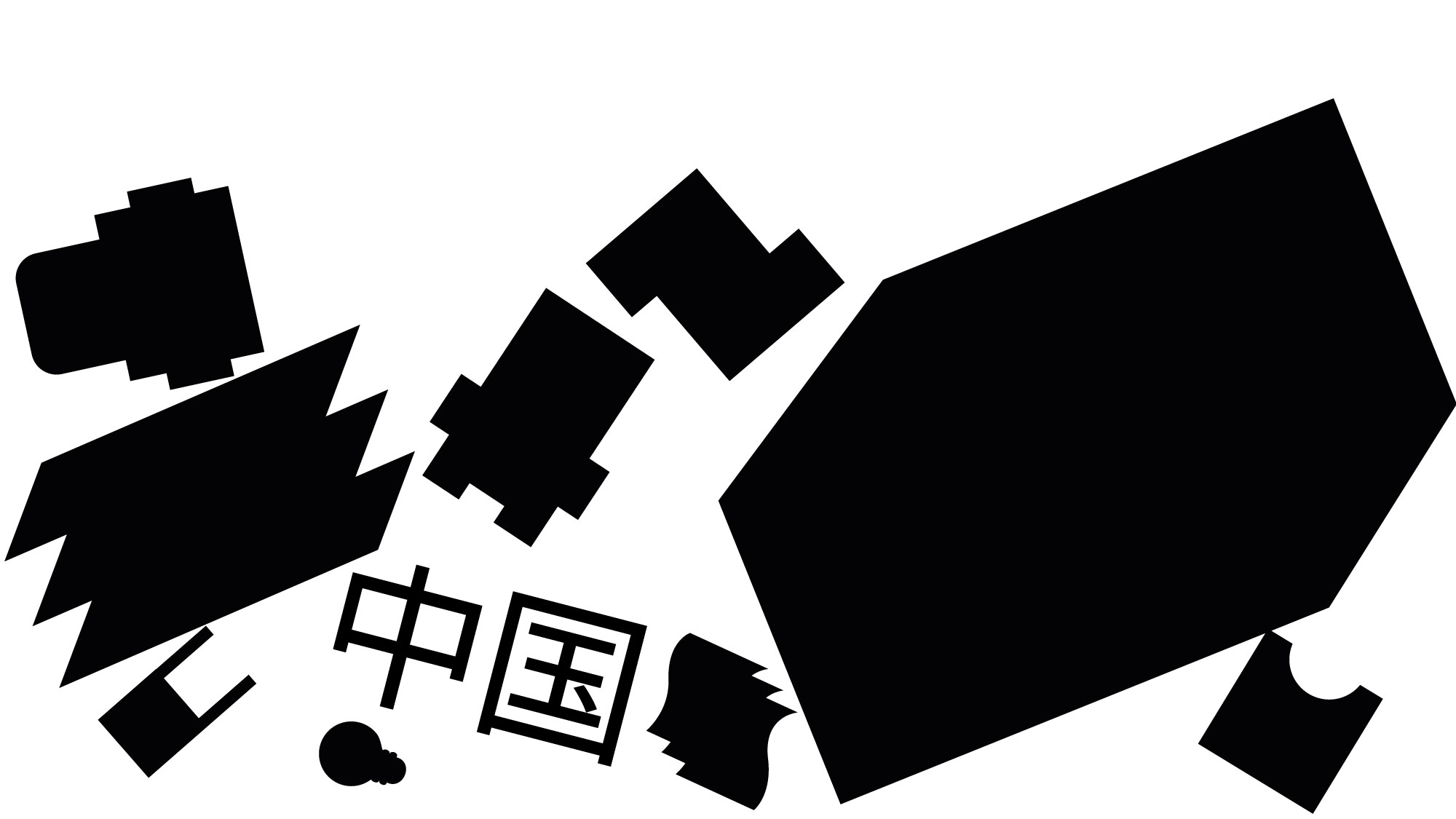
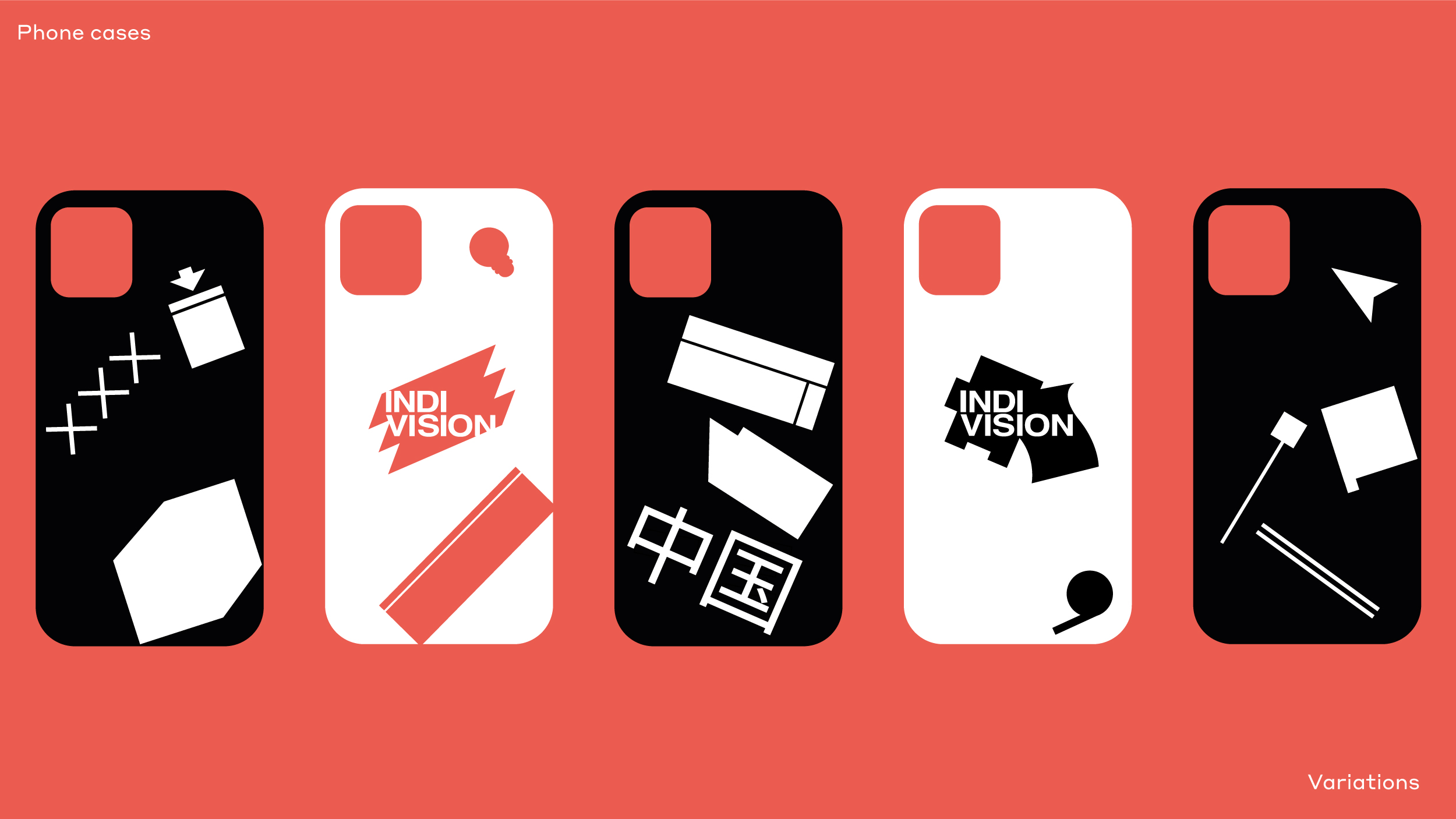
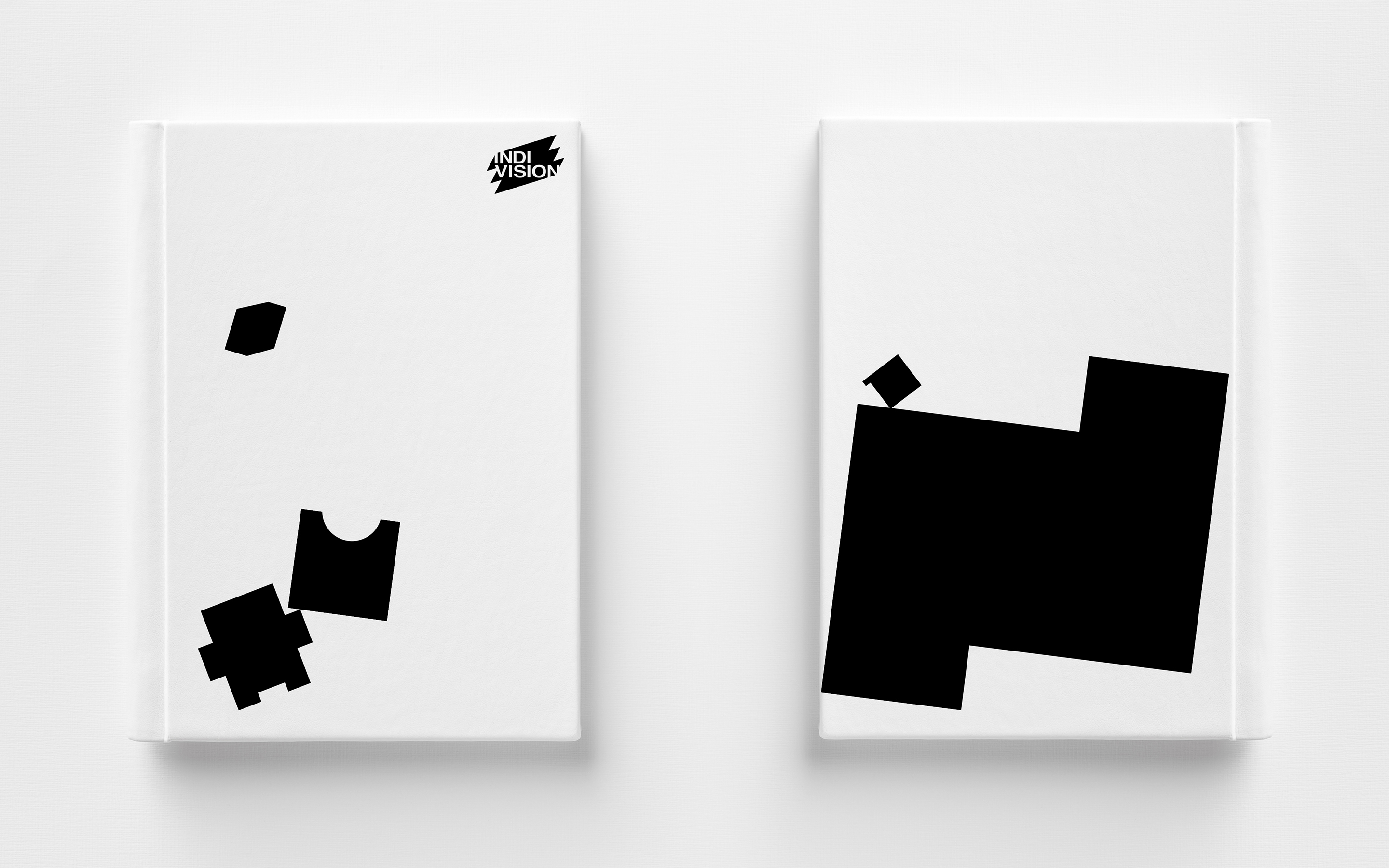
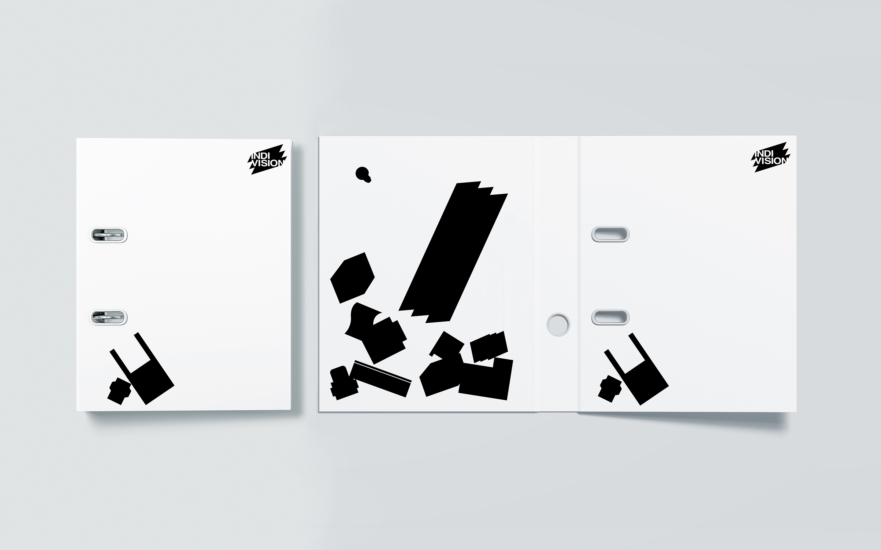
The most important advantage of the company is the variety of services. They are engaged in all types of printing, they deliver special materials for projects, they do design, editing and many other services. Base on this information was born the idea to encode each service into it’s own icon, thereby emphasizing the diversity of services.

-
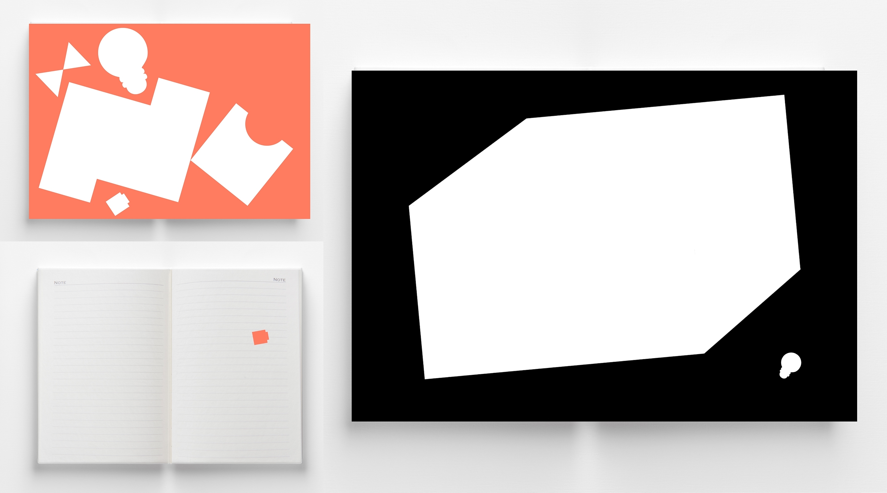
The color scheme is strict and restrained. But as a compensating was chosen soft and warm color «Living coral». The company maintains a balance between business activity and friendly informal atmosphere.
-
-
-
Styrene A was chosen as the font. It’s simple and geometric sans serif, which doesn’t attract a lot of attention and allows the main identity figures to come out on top.
-
-
Each figure appears on the business cards according to the specialization of the employee. If it is a proofreader, proof-reading signs appears on a business cards. If it is a deliverer, delivery signs appears in design and so on for each specialty.
-
-
The figures feel free to mix in space, fly, fall and change color. The site remains minimalistic and clean, the figures support communication and appear on the main pages of the interfaces.
-

-